 Buttons in Web Design")
Website: Crystaylorcreative.com
In the world of web design, every click matters. The Call-to-Action (CTA) button is a pivotal element that guides users towards desired actions, whether it’s making a purchase, signing up for a newsletter, or exploring more content. Crafting an effective CTA button requires a careful balance of design, psychology, and user experience considerations. In this article, we’ll explore the art of creating compelling CTA buttons that drive conversions and engagement.
Table of Contents
The Importance of CTA Buttons
CTA buttons act as digital signposts, directing users toward specific actions that align with a website’s goals. They serve as a bridge between the content or offer presented and the user’s engagement. The effectiveness of a CTA button can make or break the success of a website, as it directly influences conversion rates, user interactions, and overall user satisfaction.
Designing Compelling CTA Buttons
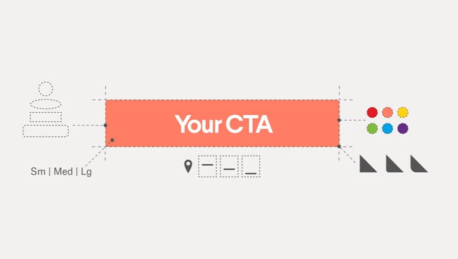
The design of a CTA button should be carefully thought out to maximize its impact. Here are key design elements to consider:
- Color Choice: The color of a CTA button should contrast with the surrounding elements, making it visually prominent. Choose a color that aligns with your brand’s palette and elicits the desired emotional response. High-contrast colors, like vibrant red or bold green, often draw attention effectively.
- Button Text: The text on the button should be concise, action-oriented, and convey the value proposition clearly. Use action verbs and create a sense of urgency or excitement. For instance, “Get Started,” “Shop Now,” or “Download Ebook.”
- Typography: The typography of the button text should be legible, even at smaller sizes. Opt for a font that is easy to read and complements your overall website design.
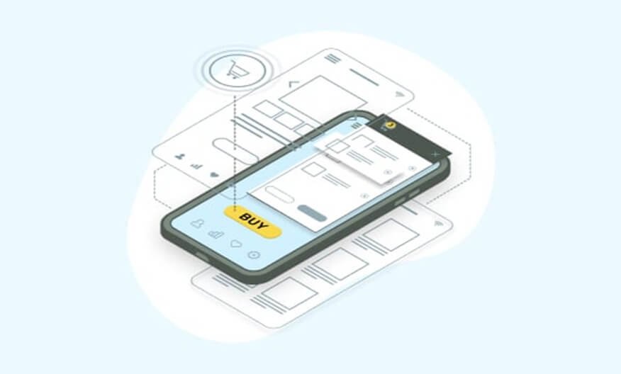
- Size and Placement: Ensure the CTA button is large enough to be noticeable, but not so large that it overwhelms the page. Place the button in a position where users’ eyes naturally travel, such as above the fold or at the end of relevant content. For example, we can see on Crystaylor Creative’s website, the CTA on the top right of her pages. It is quick to notice, and easy to click if visitors are interested.
- Whitespace: Surround the button with ample whitespace to help it stand out. This prevents visual clutter and ensures users can easily focus on the CTA.
- Shape: While square or rectangular buttons are common, consider using rounded edges or custom shapes to differentiate your CTA buttons from other elements on the page.
Psychology of Effective CTAs

Understanding user psychology is key to creating CTAs that resonate and drive action:
- Urgency: Create a sense of urgency by using phrases like “Limited Time Offer” or “Act Now.” Urgency prompts users to take action sooner rather than later.
- FOMO (Fear of Missing Out): Tap into the fear of missing out by offering exclusive deals or content that users can only access through the CTA.
- Social Proof: Incorporate social proof by highlighting the number of people who have already taken the desired action or by showcasing testimonials from satisfied customers.
- Benefit-Oriented: Focus on the benefits users will gain by clicking the CTA. Clearly communicate how the action will improve their lives or solve a problem.
User Experience and Testing
A CTA button’s effectiveness also relies on a positive user experience. Consider these aspects:
- Mobile-Friendly Design: Ensure that CTA buttons are responsive and easily clickable on mobile devices. Test their functionality on various screen sizes.
- Whitespace: Provide enough space around the button to prevent accidental clicks and enhance user experience.
- A/B Testing: Regularly conduct A/B tests to experiment with different button colors, texts, sizes, and placements. This helps identify which variations yield the best results.
- Loading Speed: CTA buttons should load quickly along with the rest of the page to prevent user frustration.
Examples of Effective CTA Buttons
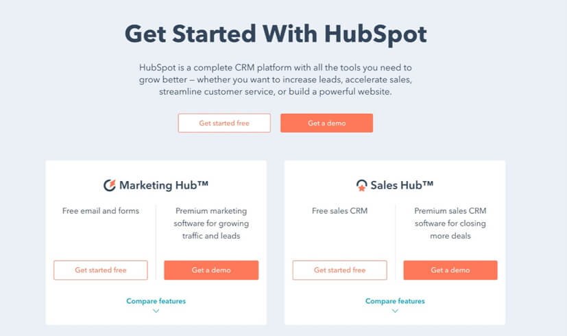
HubSpot: HubSpot employs clear and concise language in their CTA buttons, such as “Start for Free” and “Get Started.” The buttons contrast well with the background, making them highly visible.
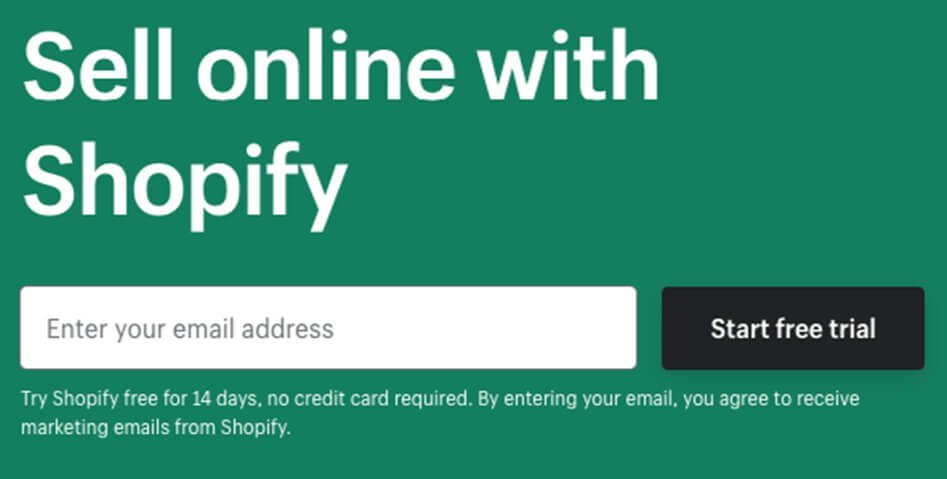
Shopify: Shopify’s CTA buttons often use first-person language, putting the user in control. For instance, “Start your free trial” establishes a personal connection.
Netflix: Netflix’s “Join Free for a Month” CTA speaks to the user’s desire for a risk-free experience. The use of “free” and “month” implies a low commitment barrier.

Creating effective Call-to-Action buttons requires a blend of design prowess and an understanding of user psychology. By carefully considering color, text, placement, psychology, and user experience, you can craft buttons that entice users to take action. Regular testing and optimization further refine your approach, ensuring that your CTAs continually drive conversions and contribute to the success of your website’s goals. Remember, a well-designed CTA button doesn’t just prompt clicks – it prompts engagement, interaction, and meaningful connections with your audience.